
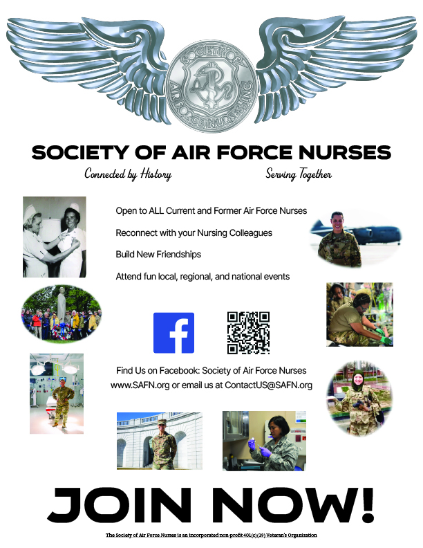
Draft #1
The client liked the uniformness of the poctures being centered together, but felt that the bulletpoints and information should be more close together. They also thought that the barcode should not repeat twice.
Draft #2
The silhouettes of the nurses was a highlight of this draft. The simplicity was also caught their eye. But they felt that the bar code needed to be more in the center and also the logo should be near the top of the page.
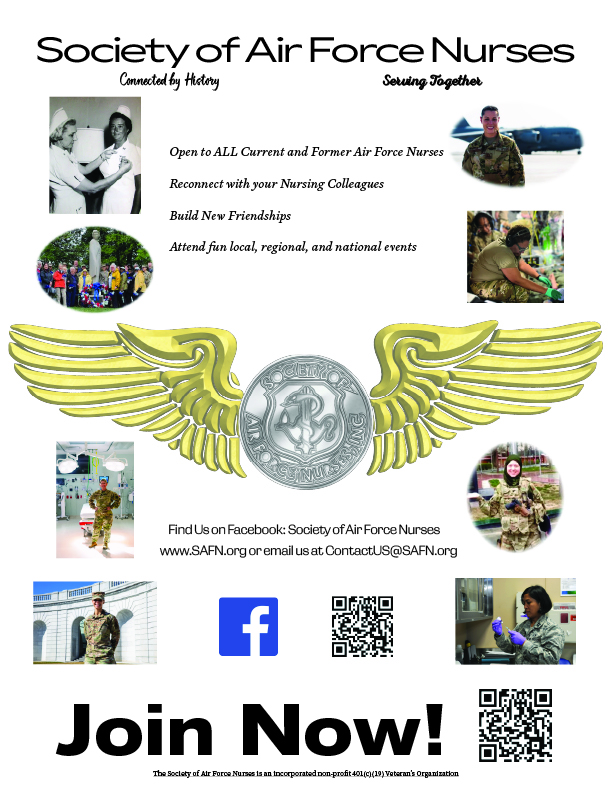
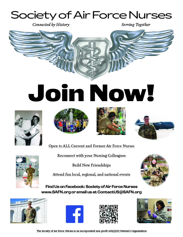
*Draft #3
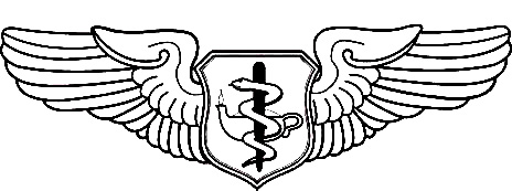
This is the draft that the client continued to go with. They liked how the pictures wrapped around the text forming a horseshoe. And the facebook and barcode proximity together was well desired. A criticism that covered all three of the drafts is to remove the gold of the wings and make the badge a singular color.
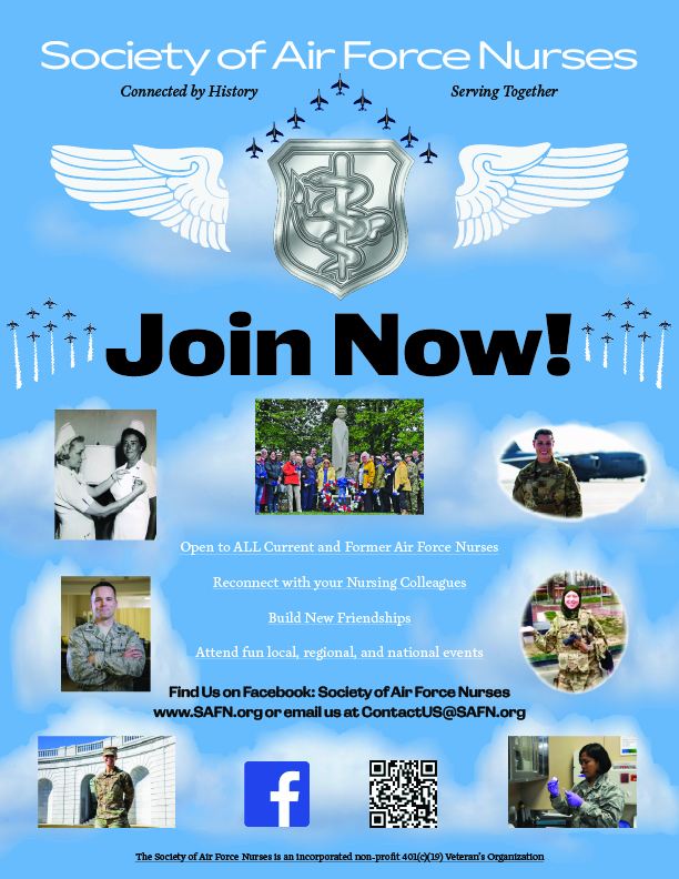
Revison #1
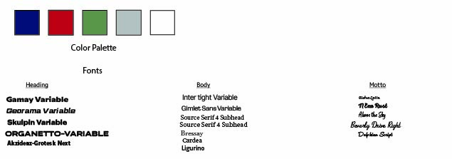
I changed the wings from gold to a teal-silver. They wanted me to also choose a font, they liked Skulpin Variable for the heading, georama variable for the title, source serif for the body, and aboev the sky for the motto.
Revision #2
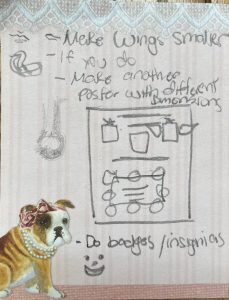
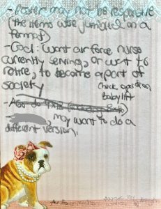
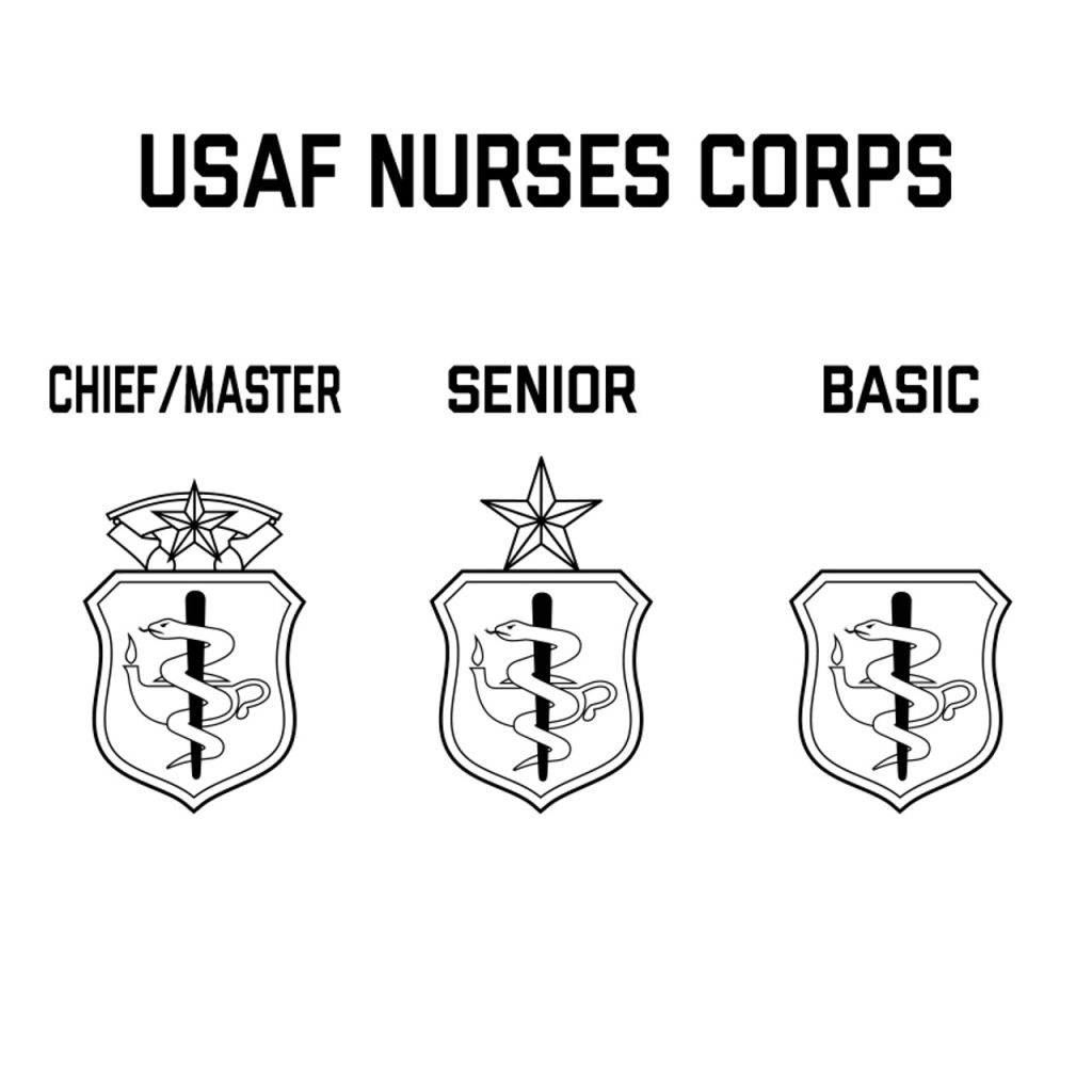
Here the pictures were changed from the horseshoe formation to a square formation. The badge was also changed to more resemble the air force nurse badges. They also wanted me to remove photos and sharpen others.
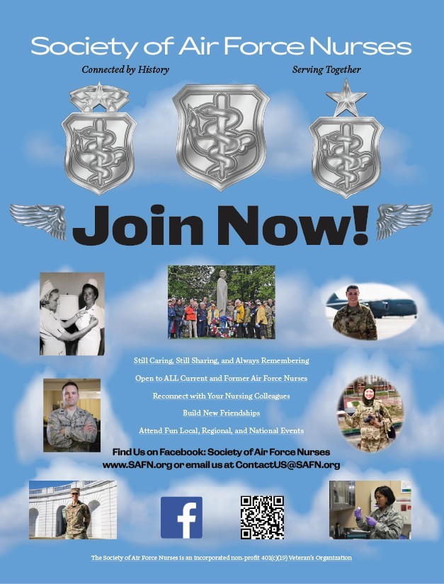
Revision #3
The wings will be removed and replaced with the chief master and senior badges to make the entry inclusive of those titles. A male nurse was also added. I will I'll remove the planes above the basic badge and add more text in the middle.

Revison #4
I made the wings silver, shrunk them, and put it on either side because the feedback said they seemed big and fake. I also cleaned up around the borders of the clouds to make them more soft and removed the white borders around the circular photos. I also added additional text and made the white body text font smaller.
Revison #5
I removed the airplanes and I moved the wings from the badges down to the sides of the "join now" because I was told that both wings on the badges must always remain intact.
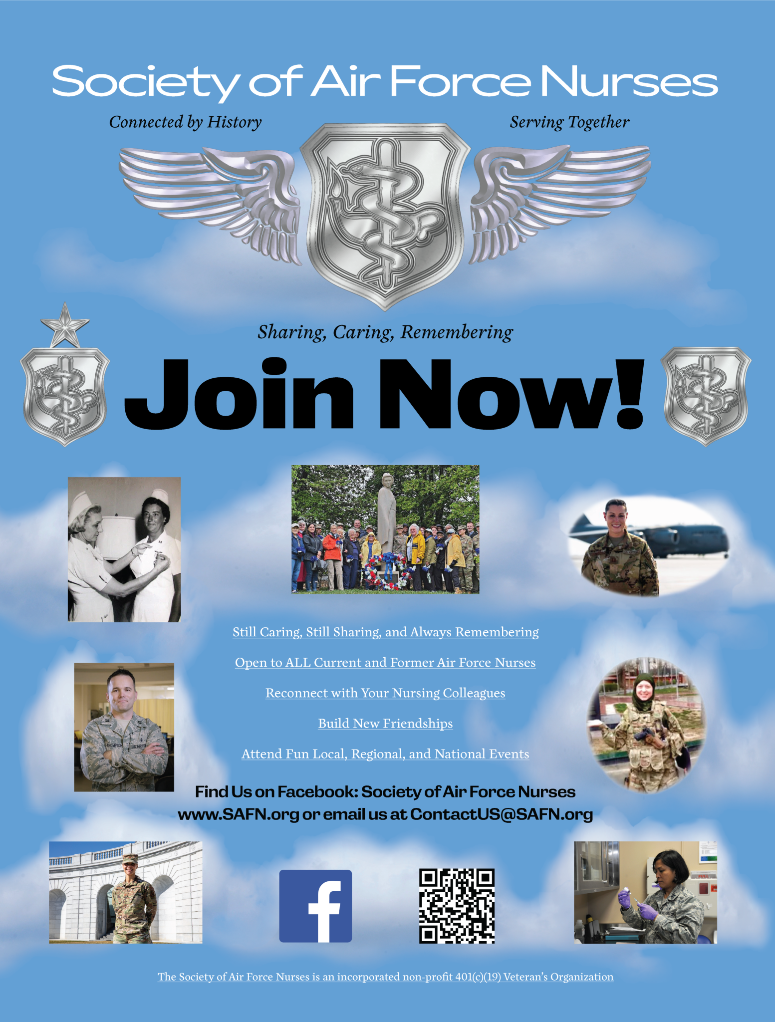
Revison #6
I placed the badges on each side of the "join now" and I attached the sulver wings to the main badge. I also made the wings less silver so they stand out more. I also added the motto to the bottom of the badge.
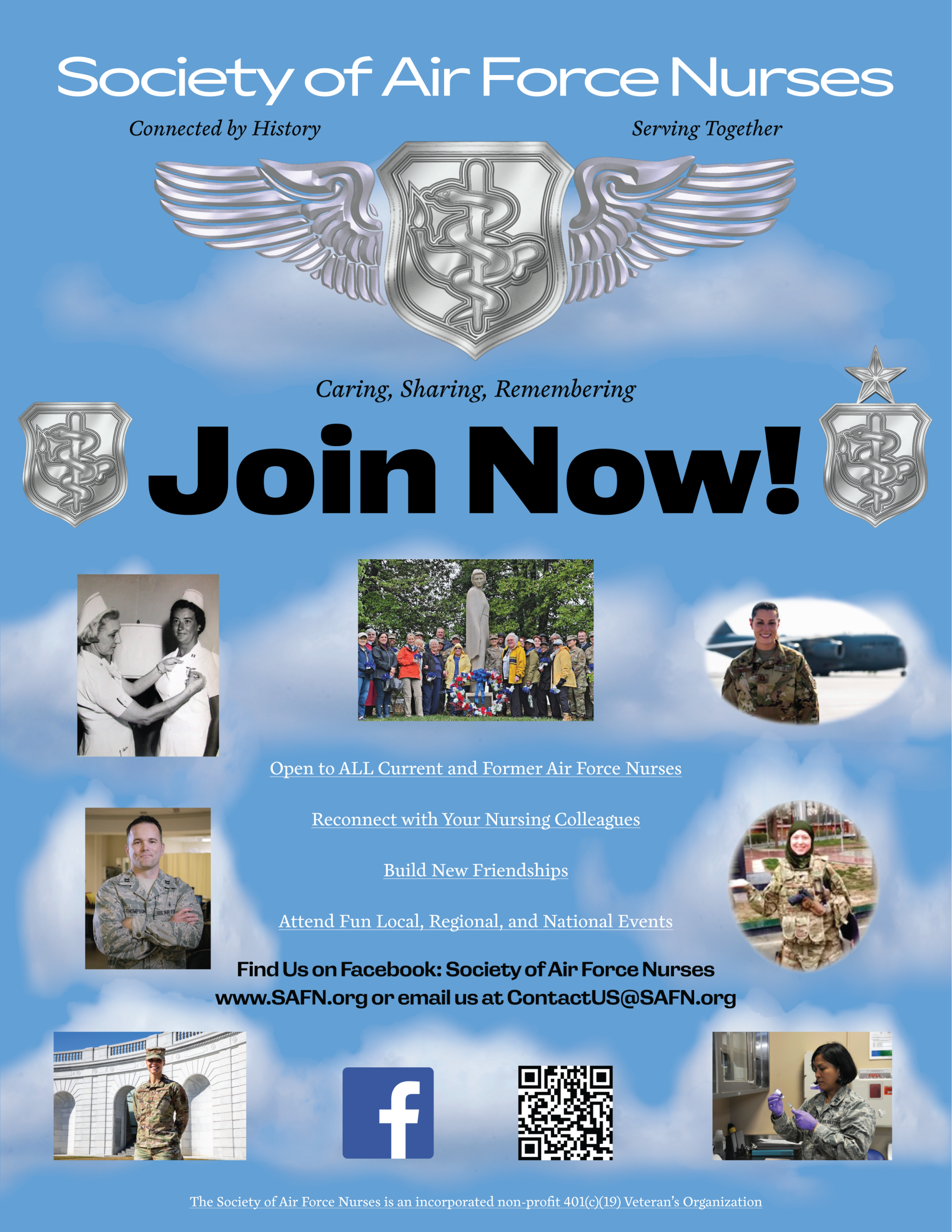
The Final Revision
I switched the badges and brought the wings closer together. I also removed the "sharing, caring and remembering" from the ring since it was already below the winged badge.